Extrapolating Data to Fill in Missing Values
It’s not by just filling with mean, and median values, or by dropping rows with missing values, that the problem of missing data can be solved. In this particular case, we are going to see, it was solved by extrapolation. We were dealing with the problem of Tamilnadu’s population. Population as you know is counted only once in ten years, but then how do we fill in the missing stuff? The simple answer in this case is to extrapolate it.
Now let’s import the necessary libraries to do this work.
import pandas as pd
import numpy as np
import matplotlib.pyplot as plt
The data is in the file names tamilnadu_population_1981_to_2025.csv, let’s load it as a dataframe.
tamilnadu_population = pd.read_csv("tamilnadu_population_1981_to_2025.csv")
When we check its head, as shown below, it’s values contains zeros, for population for the year 1982 and so on.
tamilnadu_population.head()
| Year | Population (in millions) | |
|---|---|---|
| 0 | 1981 | 48.41 |
| 1 | 1982 | 0.00 |
| 2 | 1983 | 0.00 |
| 3 | 1984 | 0.00 |
| 4 | 1985 | 0.00 |
Let’s plot the data as shown below:
x_axis = tamilnadu_population["Year"]
y_axis = tamilnadu_population["Population (in millions)"]
plt.scatter(x_axis, y_axis, color = 'green')
plt.title("TamilNadu Population",color = "blue")
plt.xlabel("Year",color = "blue")
plt.ylabel("Population (in millions)", color = "blue")
plt.figure(figsize = (8,5))
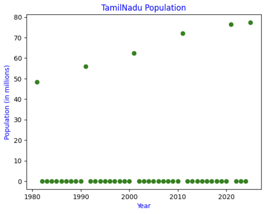
You see a lot of data points that are not there lies on the x-axis, this doesn’t mean that Tamilnadu’s population was wiped out from 1982 to 1990, and was magically restored by God during 1991.
Now to fill the missing values we replace the zeros with NaN.
tamilnadu_population["Population (in millions)"] = tamilnadu_population["Population (in millions)"].replace(0.00, np.nan)
tamilnadu_population.head()
| Year | Population (in millions) | |
|---|---|---|
| 0 | 1981 | 48.41 |
| 1 | 1982 | NaN |
| 2 | 1983 | NaN |
| 3 | 1984 | NaN |
| 4 | 1985 | NaN |
Now we use the interpolation method to fill in the missing values:
tamilnadu_population["Population (in millions)"] = tamilnadu_population["Population (in millions)"].interpolate(method='linear')
tamilnadu_population.head()
| Year | Population (in millions) | |
|---|---|---|
| 0 | 1981 | 48.41 |
| 1 | 1982 | 49.155 |
| 2 | 1983 | 49.900 |
| 3 | 1984 | 50.645 |
| 4 | 1985 | 51.390 |
Now let’s plot the refined data as shown below:
x_axis = tamilnadu_population["Year"]
y_axis = tamilnadu_population["Population (in millions)"]
plt.scatter(x_axis, y_axis, color = 'green')
plt.title("TamilNadu Population",color = "blue")
plt.xlabel("Year",color = "blue")
plt.ylabel("Population (in millions)", color = "blue")
plt.figure(figsize = (8,5))
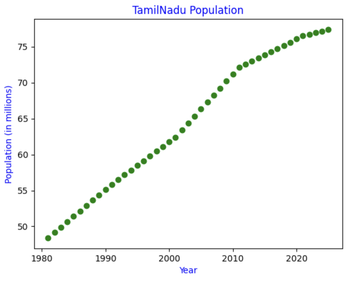
Ah! Much better!!
Code
Credits
- Naveen Kumar for gathering the data.
- Subha for working on the data.